Redesigning Fidari website for better trust & conversion
Redesigning Fidari website for better trust & conversion


Disclamer
Disclamer
I'm part of 10kdesigners (a product design cohort). This project is my landing page assignment in the cohort.
I'm part of 10kdesigners (a product design cohort). This project is my landing page assignment in the cohort.
Why did I choose Fidari?
Why did I choose Fidari?
Based on personal experience and conversations that I held with people around me, it felt that from a user’s perspective, a site that caters to a cancer survivor’s specific needs is required.
Fidari does exactly that but I noticed that improvements in their Landing page could be done to improve their user experience which is centered around two things: “Empathy” and “Respect”
Keeping that in mind, here is how I went about redesigning it.
Have you ever wondered what goes behind the scenes for a cancer patient?
Have you ever wondered what goes behind the scenes for a cancer patient?
This was pretty much the thought that I had once I started with the design process.
This was pretty much the thought that I had once I started with the design process.
Goal 1: Identifying User persona
Goal 1: Identifying User persona


User Persona
What would Sam need right now?
What would Sam need right now?
A service provider which does exactly what it claims to do
Preferably, a one stop shop that would try and understand his varied needs ( like at home care or in clinic care)
Somebody to facilitate the process and make him understand how things work
A service provider which does exactly what it claims to do
Preferably, a one stop shop that would try and understand his varied needs ( like at home care or in clinic care)
Somebody to facilitate the process and make him understand how things work
Enter Fidari.
Enter Fidari.
A service provider which keeps the needs of a cancer warrior/survivor in mind. It provides services that are customized alongside regular check up facilities, mental health services and promises to aid the warrior/survivor along.
Now if Sam gets a chance to go onto Fidari’s, here are few of the things that may confuse him and make him feel unsure about using their services
It is too text heavy
Categories are not well defined
What services are being provided is unclear
Goal 2: UX Audit
Goal 2: UX Audit
To improve the currently live landing page & get a better conversion rate. I need to first identify the problems in the existing one. One of the ways to get a better understanding of the problem is by doing a UX audit.
To improve the currently live landing page & get a better conversion rate. I need to first identify the problems in the existing one. One of the ways to get a better understanding of the problem is by doing a UX audit.


Complete UX Audit of Fidari website
Complete UX Audit of Fidari website
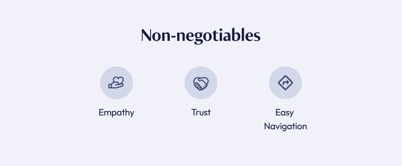
With the audit, I made a list of non-negotiable items that need to be incorporated into the redesign process.
With the audit, I made a list of non-negotiable items that need to be incorporated into the redesign process.

List of non-negotiables
List of non-negotiables
Empathy: Empathize with the user throughout be it through language, visuals, user flow.
Trust: Building trust throughout the landing page so that it gives user the confidence to trust Fidari.
Easy Navigation: Making sure the user understands what Fidari is giving them without increasing their cognitive load which can happen when you have a cluttered UI.
Research
Research
Now that the problem statement is broken down into smaller chunks. I need to understand how the competitors are showcasing their services.
There are 2 type of competitors-
Now that the problem statement is broken down into smaller chunks. I need to understand how the competitors are showcasing their services.
There are 2 type of competitors-


The journey begins : Pen and Paper to the win
The journey begins : Pen and Paper to the win
With the IA decided, I started with pen and paper wireframes. After many iterations, playing with the info I had, and the competitors landing pages I saw during my research, I started with the visual design.
With the IA decided, I started with pen and paper wireframes. After many iterations, playing with the info I had, and the competitors landing pages I saw during my research, I started with the visual design.


Pen & Paper wireframes
Pen & Paper wireframes
What is the vibe?
What is the vibe?
After going through several iterations for the landing page, it started taking shape.
Some decisions I made about the visual style:
Hopeful and welcoming
Photography instead of illustrations
Modern, Clean Minimalist
Keeping all this in mind I came up with a landing page that is informative, easy to navigate and at the same time it doesn’t increase the cognitive load of the user(using images and limited text)


Full landing page iterations
After receiving the initial feedback, I gained a better understanding of how to proceed with further iterations. One thing that was consistently mentioned in the feedback was the color. It was noted that the green color was not associated with cancer care. In response to this feedback, I changed the color from green to blue.
After receiving the initial feedback, I gained a better understanding of how to proceed with further iterations. One thing that was consistently mentioned in the feedback was the color. It was noted that the green color was not associated with cancer care. In response to this feedback, I changed the color from green to blue.


Breaking down the UI
Breaking down the UI
A. Hero section
A. Hero section
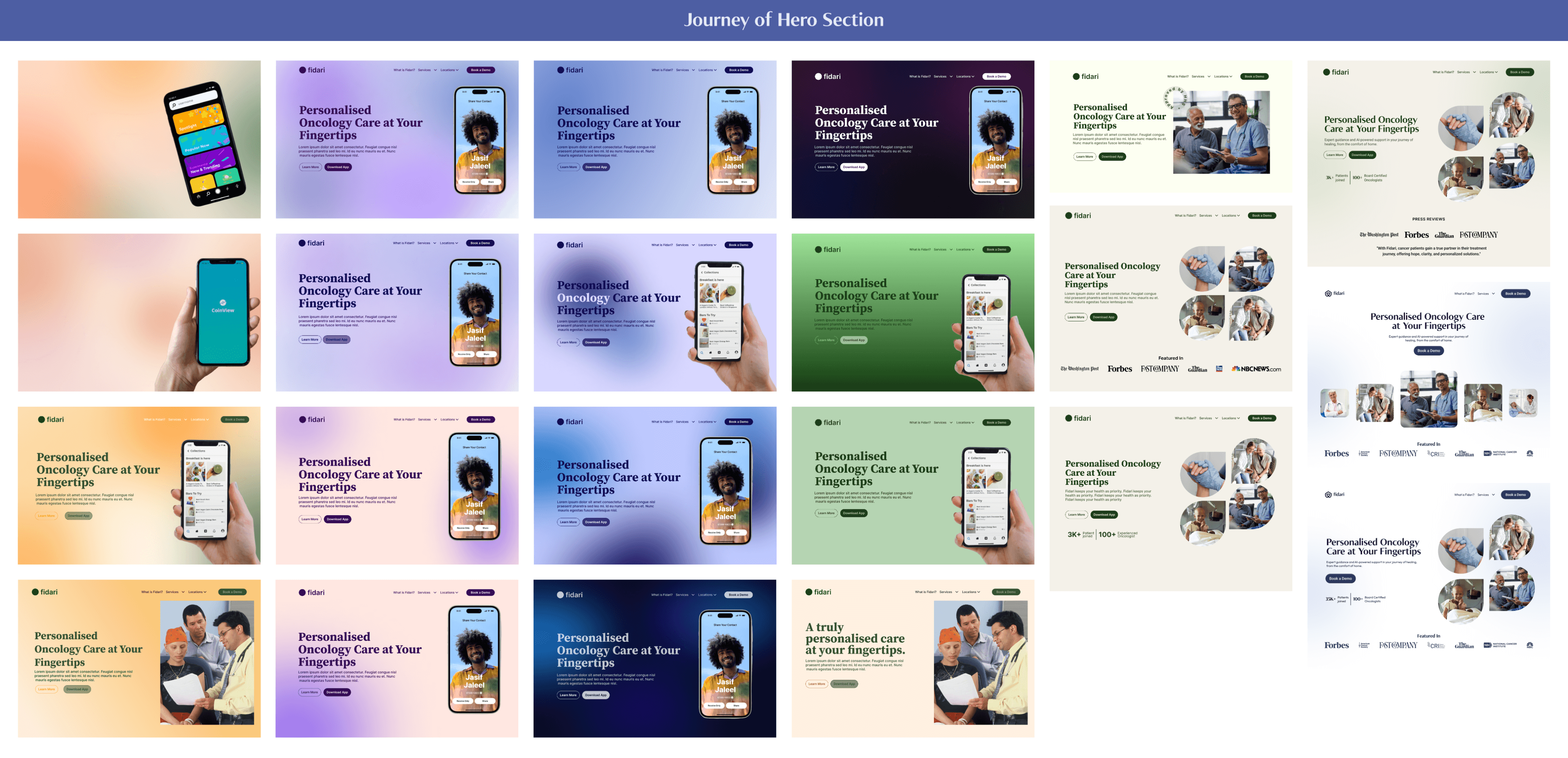
Hero section being the most important part of the landing page. The demand of building the trust and implementing the solutions on the hero section itself is high. I want to get user hooked to the hero section and give them an overall idea of what Fidari is. I’ve explored many iterations on how to display the info and build trust with the same time.
Statistically, 40% of users do not go past the Hero section. Even if they do, building trust in the hero section itself will be a win win for both the users and the company. As it will also help in increasing the conversion rate.
One of the confusing parts of the currently live landing page is that it doesn’t convey what Fidari does. More importantly, it lacks in empathizing with the user and building trust in the hero section.


B. Features
B. Features
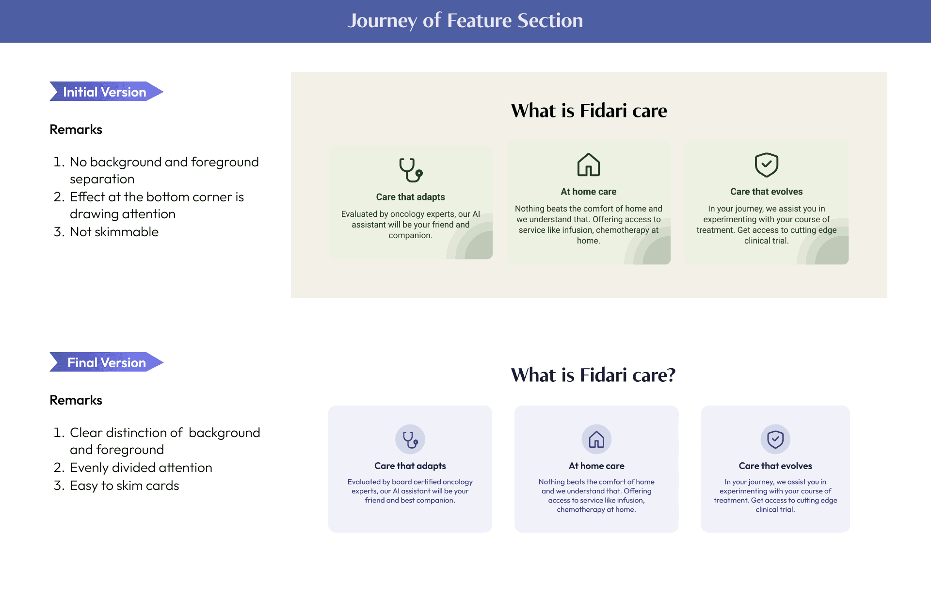
One of the challenges with the currently live landing page is that it talks about the features rather than how it will help the users.
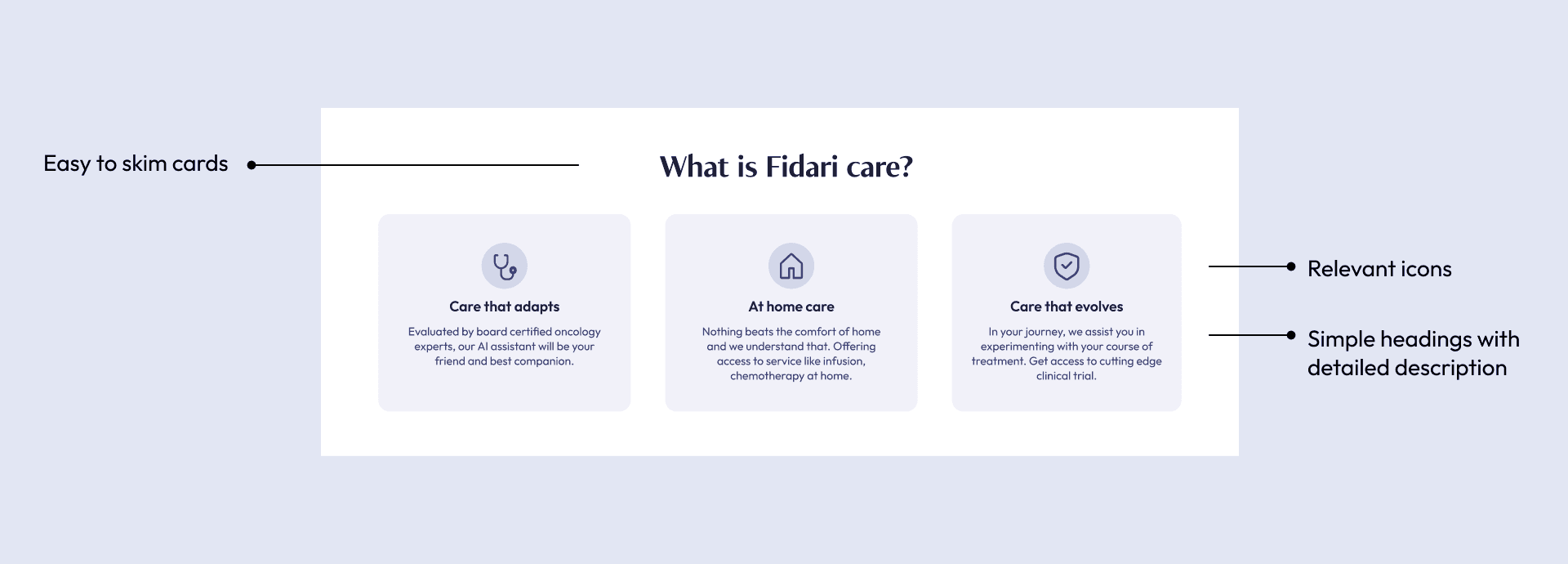
Keeping this in mind I redirected the focus to the users and how it is going to help them. This section talks about the “WHAT” the services provided by Fidari.
Hence, as a designer, I felt the cards for features should be highlighted well with the least amount of cognitive load on the user.




C. How It Works
C. How It Works
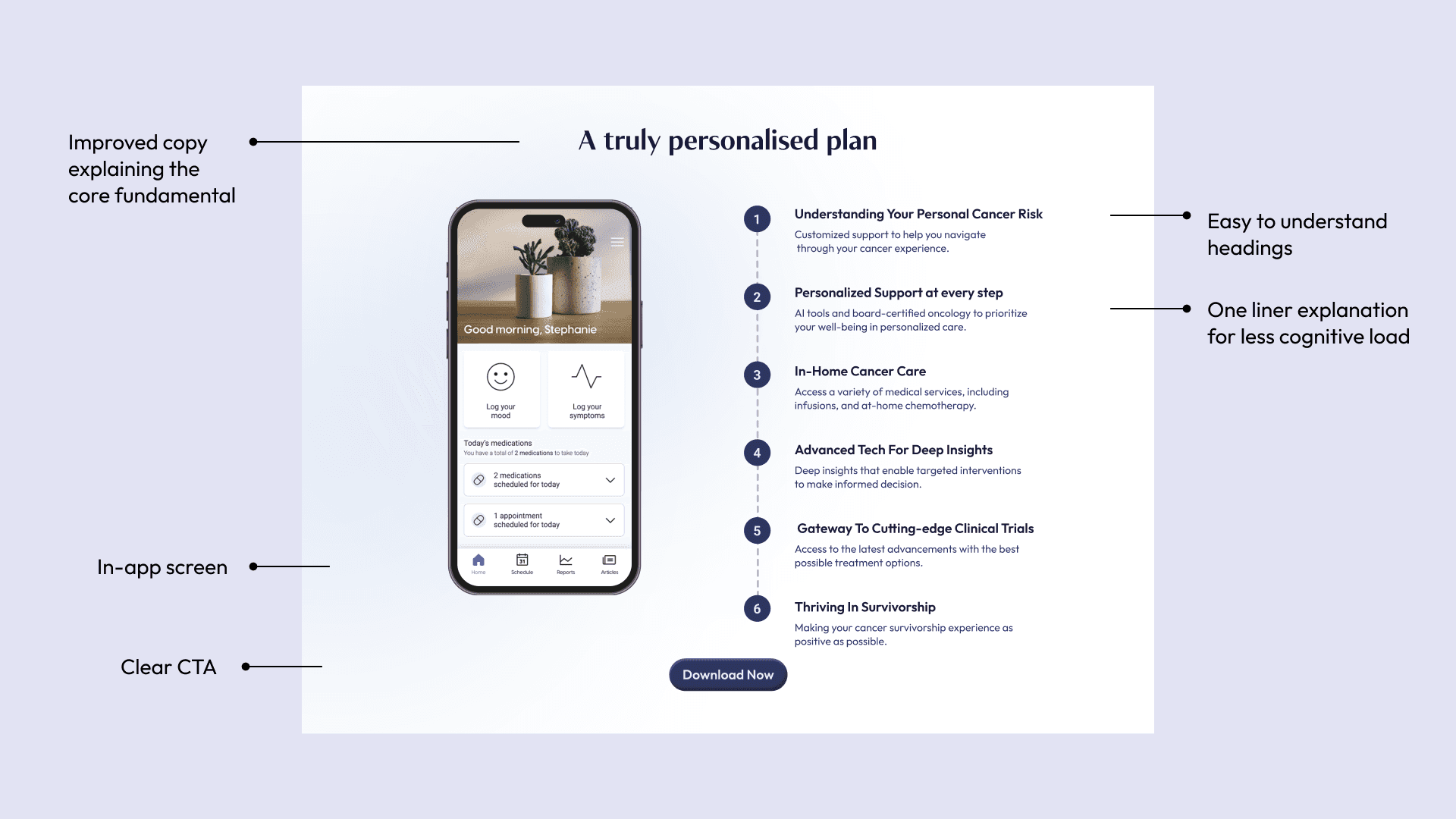
“How It Works” is the next important section as it tells the users how the features work and how using the app is going to help them. Giving the information in small chunks with heading for easier scannability. Keeping the info crisp reduces the possibility of an user getting lost in the sea of information.
“How It Works” is the next important section as it tells the users how the features work and how using the app is going to help them. Giving the information in small chunks with heading for easier scannability. Keeping the info crisp reduces the possibility of an user getting lost in the sea of information.




D. Testimonial
D. Testimonial
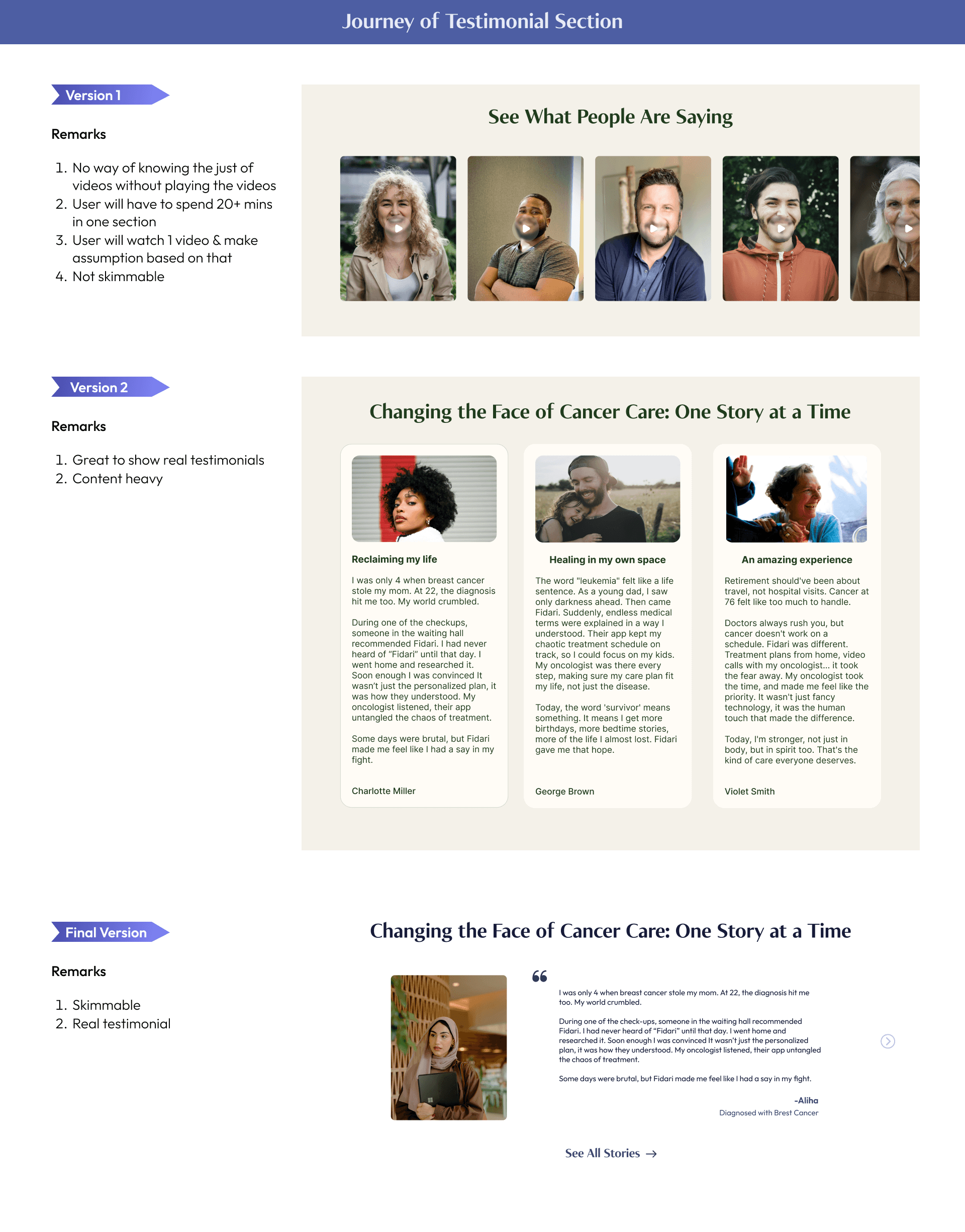
It has been observed and tested that Social proof has a great impact on user decisions. Hence, I included this during the redesign. When the whole idea is that the user can trust Fidari, it is important to showcase how it has worked for other users.
Being part of a community always helps. Getting to know that there are people who are dealing with a similar situation as you, helps ease the process.
Keeping all this in mind, adding a new section for testimonial and placing right after the service details is an intentional step which will also help in increasing the conversion rate.


E. Call to Action (CTA)
E. Call to Action (CTA)
It is a new section that I added during the redesign.
Although the landing page should conveys a sense of empathy towards the patients. Landing page is meant for conversion. Adding an entire section showcasing CTA, no. of downloads, etc helps in both conversion and building social trust.
It is a new section that I added during the redesign.
Although the landing page should conveys a sense of empathy towards the patients. Landing page is meant for conversion. Adding an entire section showcasing CTA, no. of downloads, etc helps in both conversion and building social trust.


F. Blogs
F. Blogs
This addition to the website is to increase the confidence of the user while opting this particular service provider. Bear in mind, this feature can be an overkill in some other website like a gaming platform, music streaming platform but here, it is critical as FIdari has an ethical responsibility in disseminating information on Cancer.
This addition to the website is to increase the confidence of the user while opting this particular service provider. Bear in mind, this feature can be an overkill in some other website like a gaming platform, music streaming platform but here, it is critical as FIdari has an ethical responsibility in disseminating information on Cancer.


G. FAQs
G. FAQs
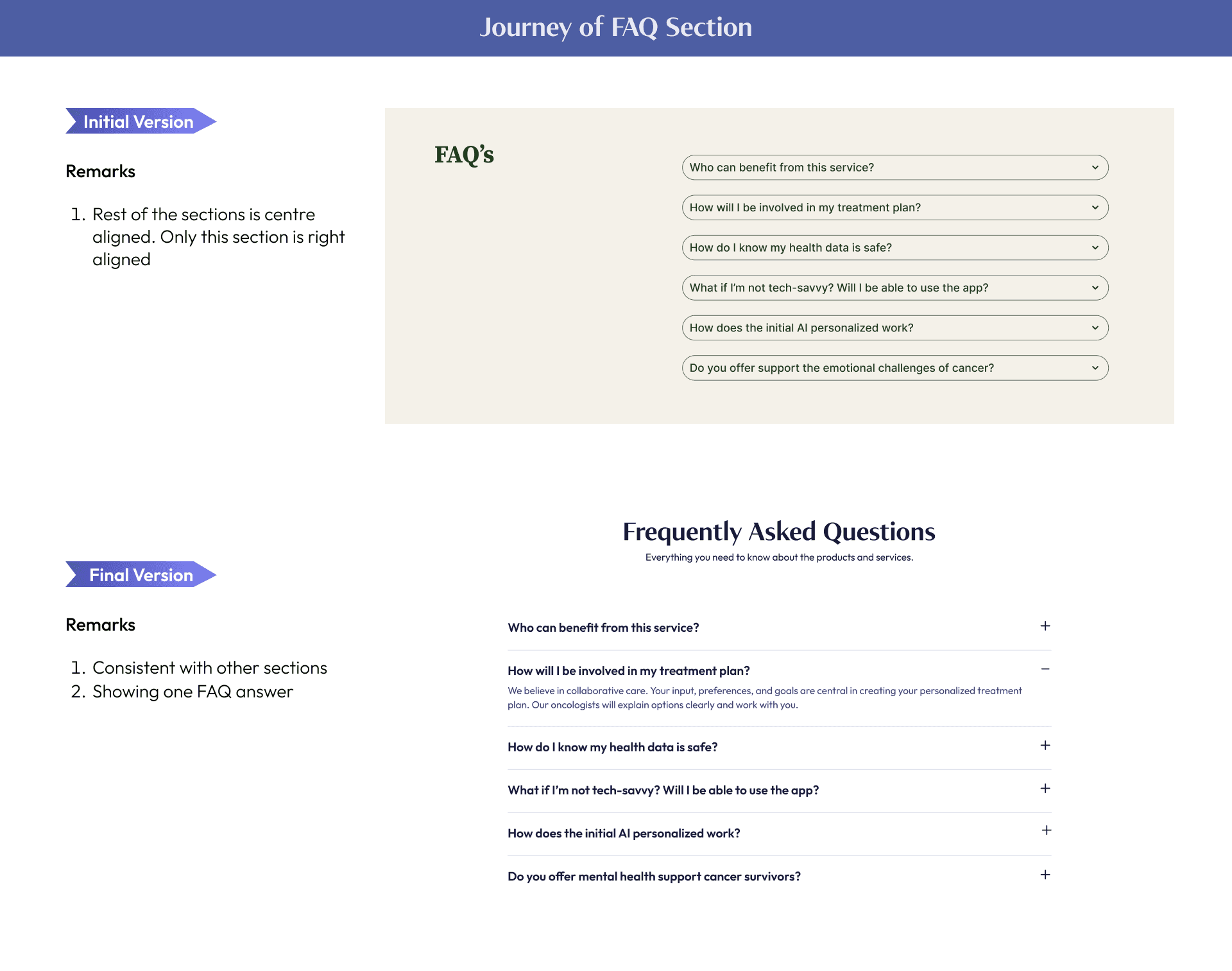
This addition to the website is to help users who are looking for a certain information get quick access to it. FAQ section is designed to answer a probable question that indicates that the questions should indeed be frequently asked
This addition to the website is to help users who are looking for a certain information get quick access to it. FAQ section is designed to answer a probable question that indicates that the questions should indeed be frequently asked


H. Footer
H. Footer
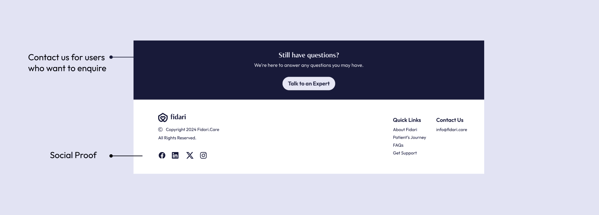
The footer contains links to contact in case of queries and, T&C, Terms of Service and Privacy Policy.
The footer contains links to contact in case of queries and, T&C, Terms of Service and Privacy Policy.




That’s all folks!
That’s all folks!
Overall I had a blast working on the project. I’ve learned so much about the domain and this project being my first has taught me how to empathize with the user.
Overall I had a blast working on the project. I’ve learned so much about the domain and this project being my first has taught me how to empathize with the user.
Behind the Scenes
Behind the Scenes
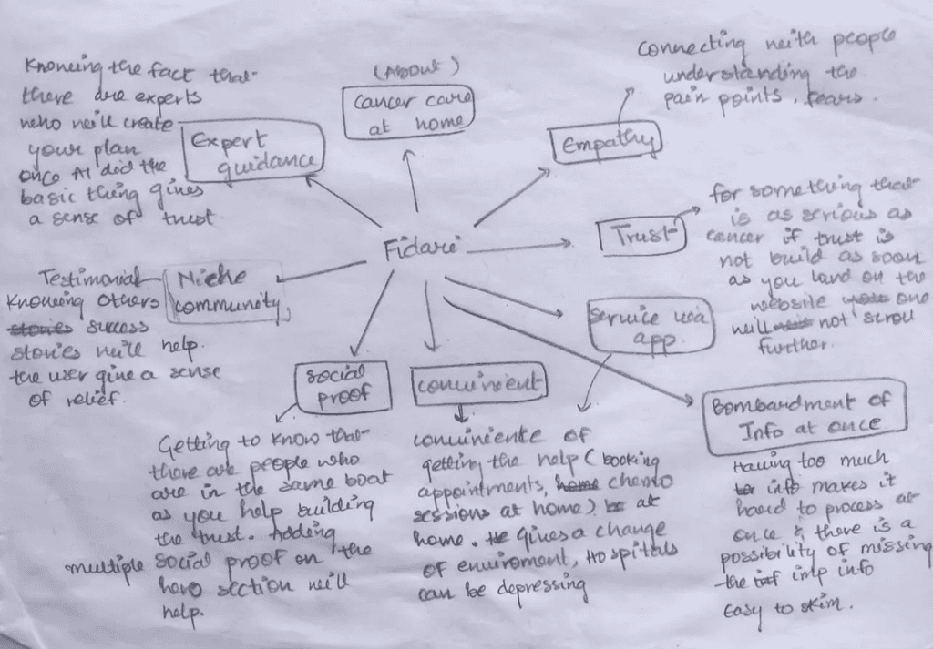
Here is a glimpse of how I approached my case study.k
Here is a glimpse of how I approached my case study.k


Learning & takeaways
Learning & takeaways
Thinking from User perspective — Empathizing with the users and considering their perspective has helped me make better design decisions.
Importance of Copy writing — If not more, the copy is as important as the visual design itself. Without good copy, the design would lose its meaning.
Iteration & Feedback — Getting feedback and iterating on design is a back-and-forth process. Looking back, there is constant improvement with each iteration that I made.
That’s a wrap!
That’s a wrap!
I thoroughly enjoyed working on this project. It was both challenging and enjoyable. A huge shoutout to fantastic folks at 10kdesigners or invaluable feedback and constant support.
Thank you so much for reading! Hope you enjoy reading the case study. I had great time working on it.
I thoroughly enjoyed working on this project. It was both challenging and enjoyable. A huge shoutout to fantastic folks at 10kdesigners or invaluable feedback and constant support.
Thank you so much for reading! Hope you enjoy reading the case study. I had great time working on it.