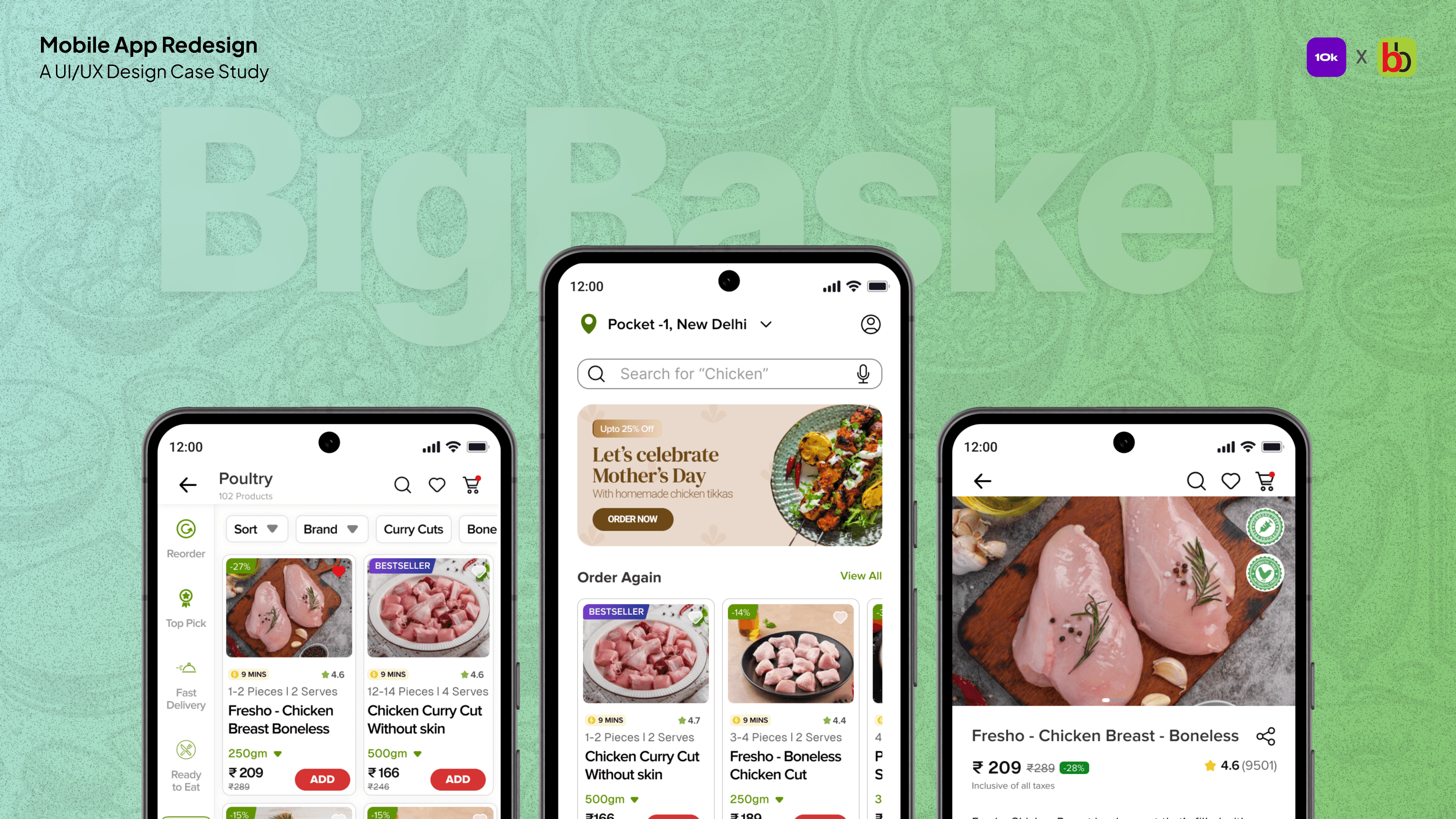
How I redesigned Bigbasket Fresho Meat to increase meat purchases
How I redesigned Bigbasket Fresho Meat to increase meat purchases
How I redesigned Bigbasket Fresho Meat to increase meat purchases
Disclamer
Disclamer
This project is a part of 10kdesigners capstone project assigned by Bigbasket. I am not associated with Bigbasket while working on it.
This project is a part of 10kdesigners capstone project assigned by Bigbasket. I am not associated with Bigbasket while working on it.
In hurry, check the outcome first
In hurry, check the outcome first
You can also test the prototype by clicking on this link. For a better experience, I recommend using the Figma Mirror App.
Imagine lying on the couch on a lazy Sunday, craving some homemade chicken tikkas and heading to your local meat shop. The shopkeeper knows your regular order, preferred cuts, and exactly what you need. These personalized touches are what drive you to return time and time again.
Now, imagine that same delightful experience in your meat-ordering app. This is precisely what we will delve into this case study.

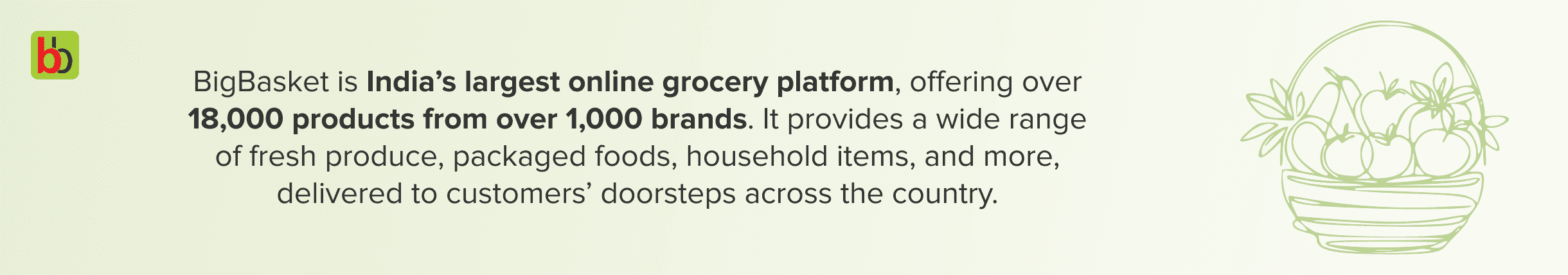
About Bigbasket
About Bigbasket
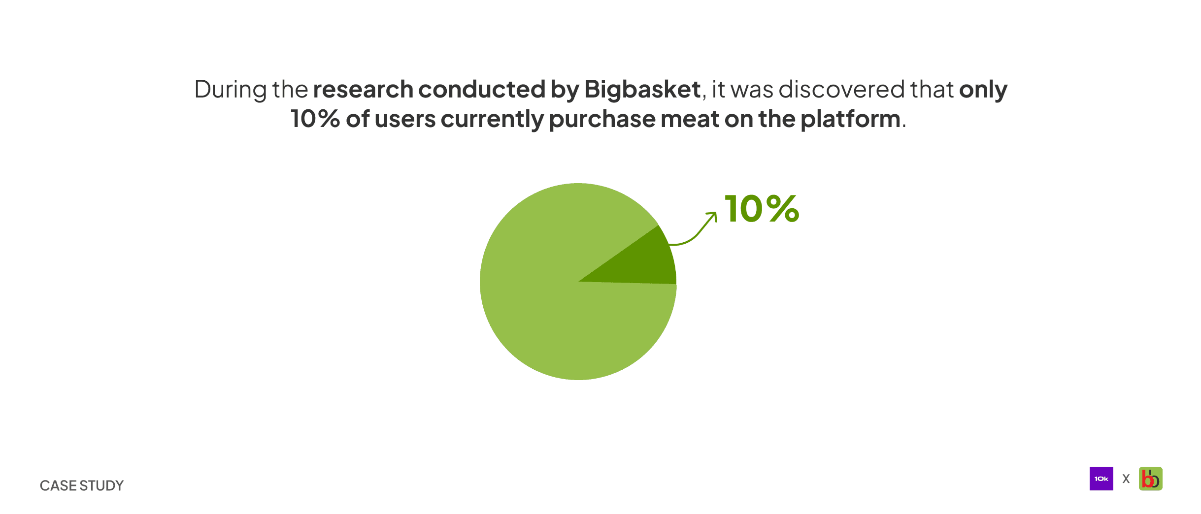
Problem statement
“
“
How might we boost the number of users purchasing meat? How can we establish dependable, consistently satisfactory experiences for users when purchasing meat?
How might we boost the number of users purchasing meat? How can we establish dependable, consistently satisfactory experiences for users when purchasing meat?
”
”

Before we start the primary research, it is essential to identify the pain points in the current design that are impacting the user experience. To achieve this, I conducted a UX audit and uncovered the following pain points.
Before we start the primary research, it is essential to identify the pain points in the current design that are impacting the user experience. To achieve this, I conducted a UX audit and uncovered the following pain points.
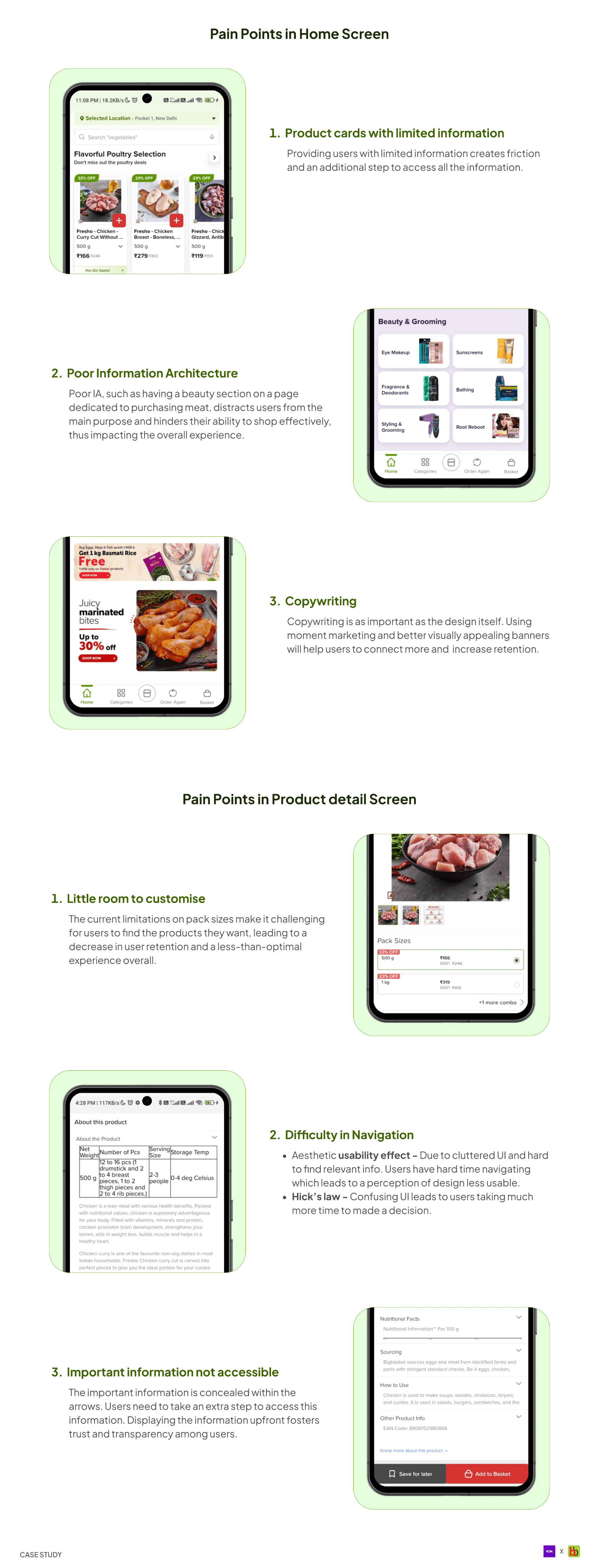
Pain points in the current design
Pain points in the current design
With the pain points identified, we can begin our journey to understand the users. What better way to start than by understanding how the e-commerce industry works?
With the pain points identified, we can begin our journey to understand the users. What better way to start than by understanding how the e-commerce industry works?
A. 3C of e-commerce industry
A. 3C of e-commerce industry
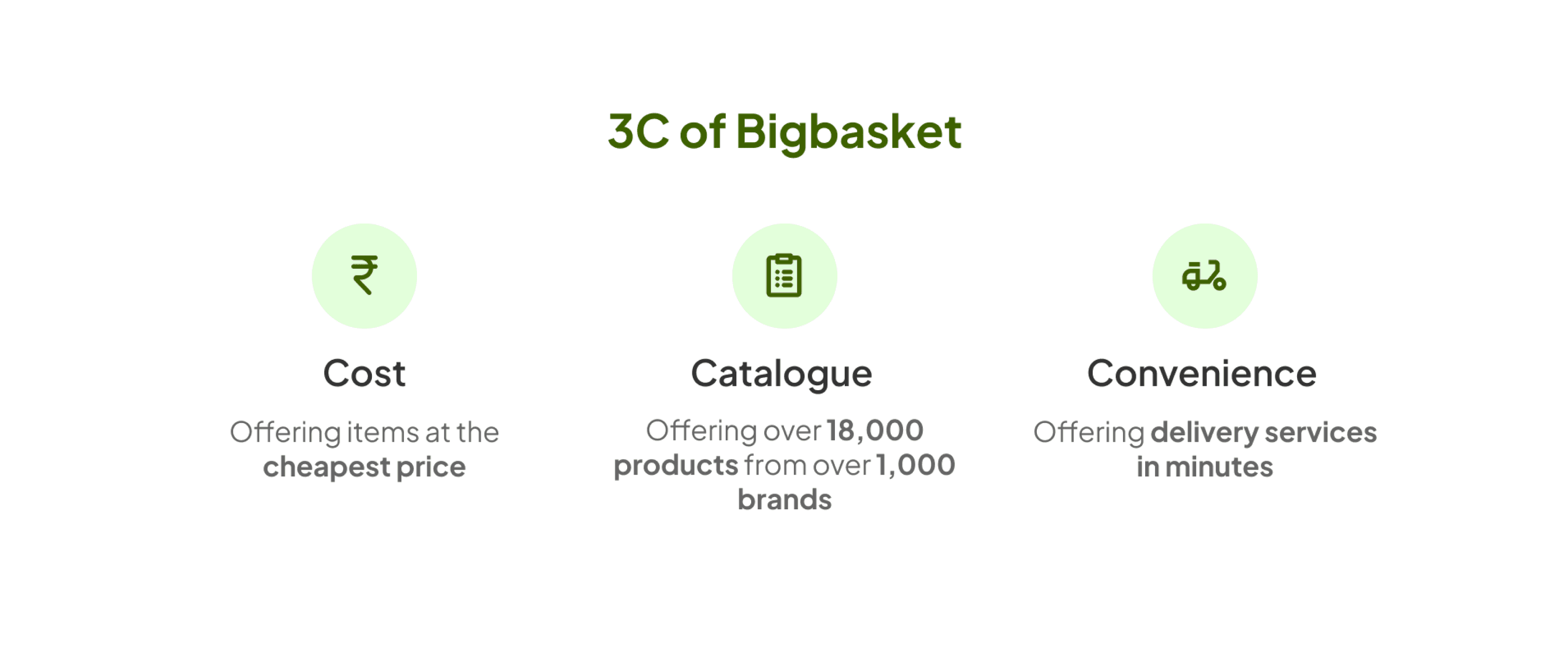
There are 3 factors that determine the success of any e-commerce.
Cost
Cost
Catalogue
Catalogue
Convenience
Convenience
Every e-commerce tries to capitalize on one or two of the three. Bigbasket capitalizes on all the 3 factors.
Every e-commerce tries to capitalize on one or two of the three. Bigbasket capitalizes on all the 3 factors.
B. Strategies competitors are using to market a new product
in their existing user base
B. Strategies competitors are using to market a new product
in their existing user base
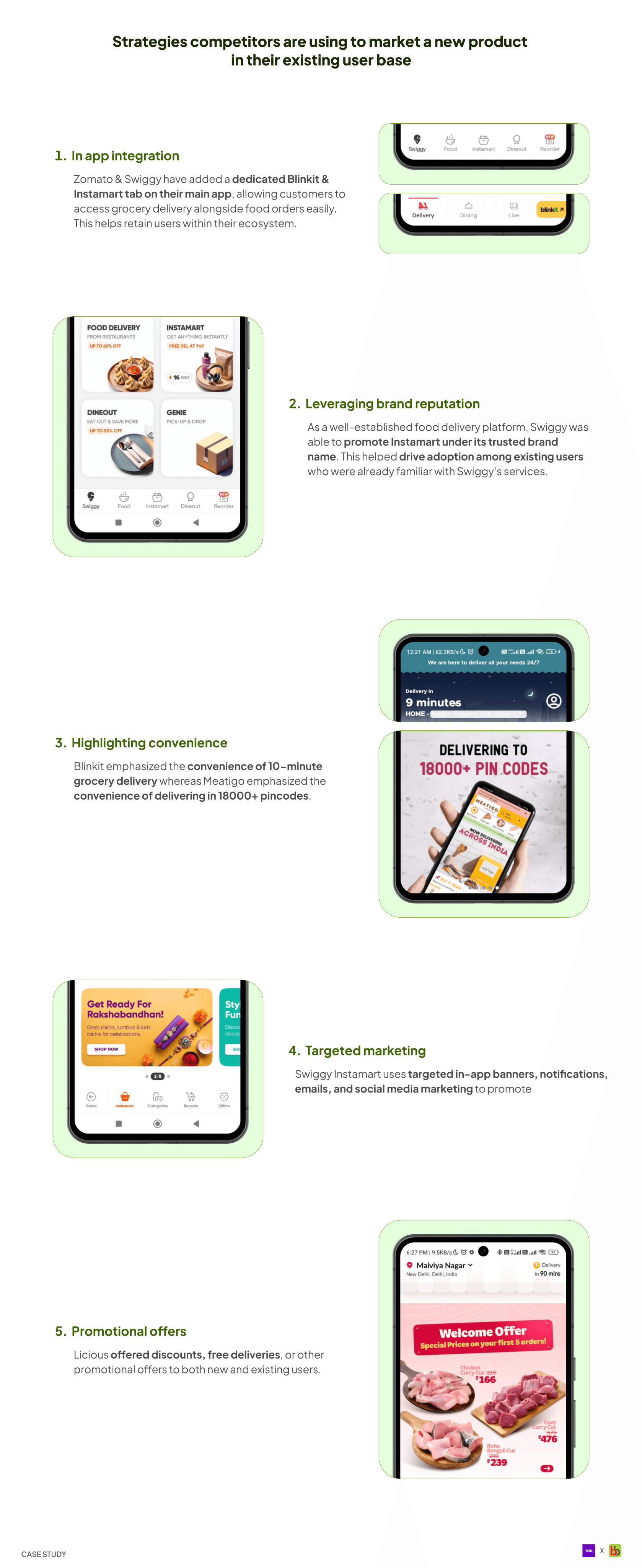
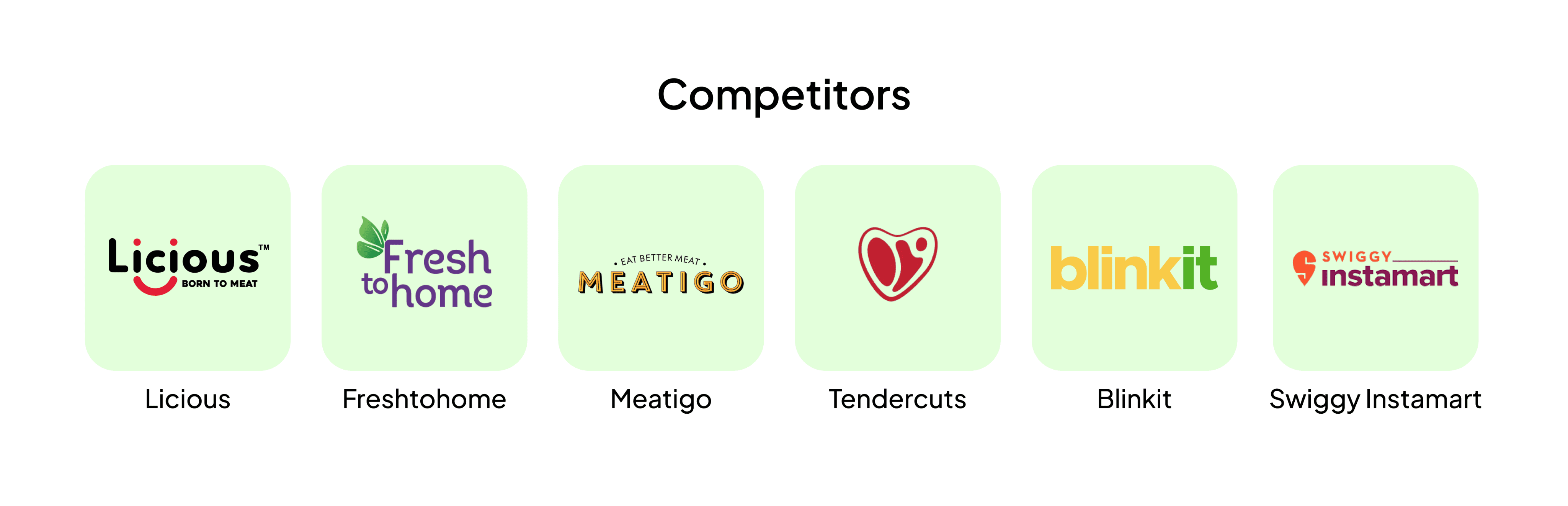
Now that we have a basic understanding of how the e-commerce industry works, let’s identify who our competitors are.
Now that we have a basic understanding of how the e-commerce industry works, let’s identify who our competitors are.
Competitor Analysis
Competitor Analysis
I reviewed all available meat delivery apps, identified key success factors, and aligned them with user needs. Additionally, I jotted down the information architecture for the redesign.
I reviewed all available meat delivery apps, identified key success factors, and aligned them with user needs. Additionally, I jotted down the information architecture for the redesign.
With a solid grasp of e-commerce and our competitors. The next order of business is to understand the user.
With a solid grasp of e-commerce and our competitors. The next order of business is to understand the user.
Understanding the users
Understanding the users
In order to curate an enhanced user experience, I first gained a deep understanding of the e-commerce industry and analyzed the competitors. The next step is to understand the users — their needs, expectations, and more. To achieve this, I conducted a user survey with a group of 20 people aged 20 to 35+ living in urban or semi-urban areas. Here are the key insights I gathered:
In order to curate an enhanced user experience, I first gained a deep understanding of the e-commerce industry and analyzed the competitors. The next step is to understand the users — their needs, expectations, and more. To achieve this, I conducted a user survey with a group of 20 people aged 20 to 35+ living in urban or semi-urban areas. Here are the key insights I gathered:
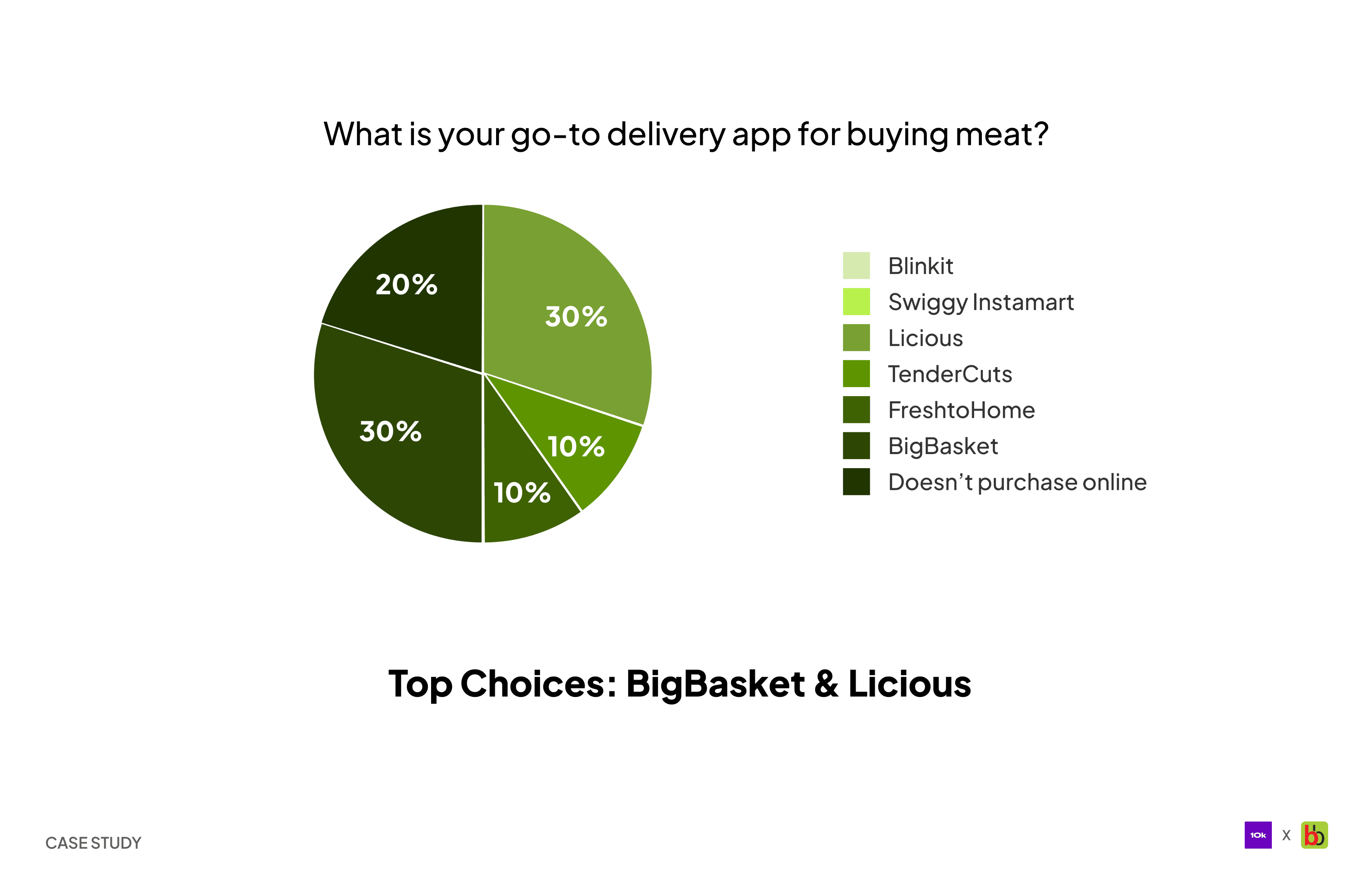
Go-to delivery app for buying meat
Go-to delivery app for buying meat
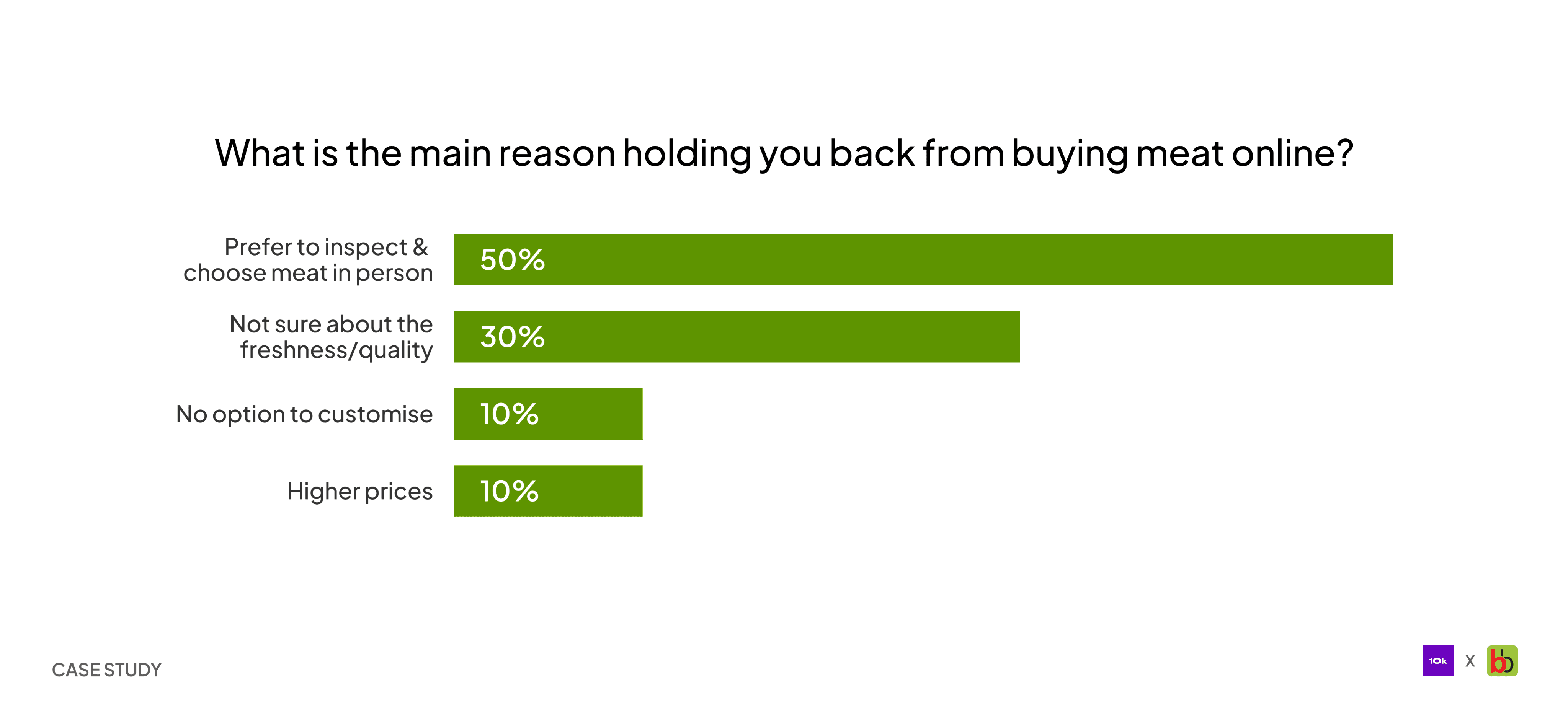
Main reason holding you back from buying meat online
Main reason holding you back from buying meat online
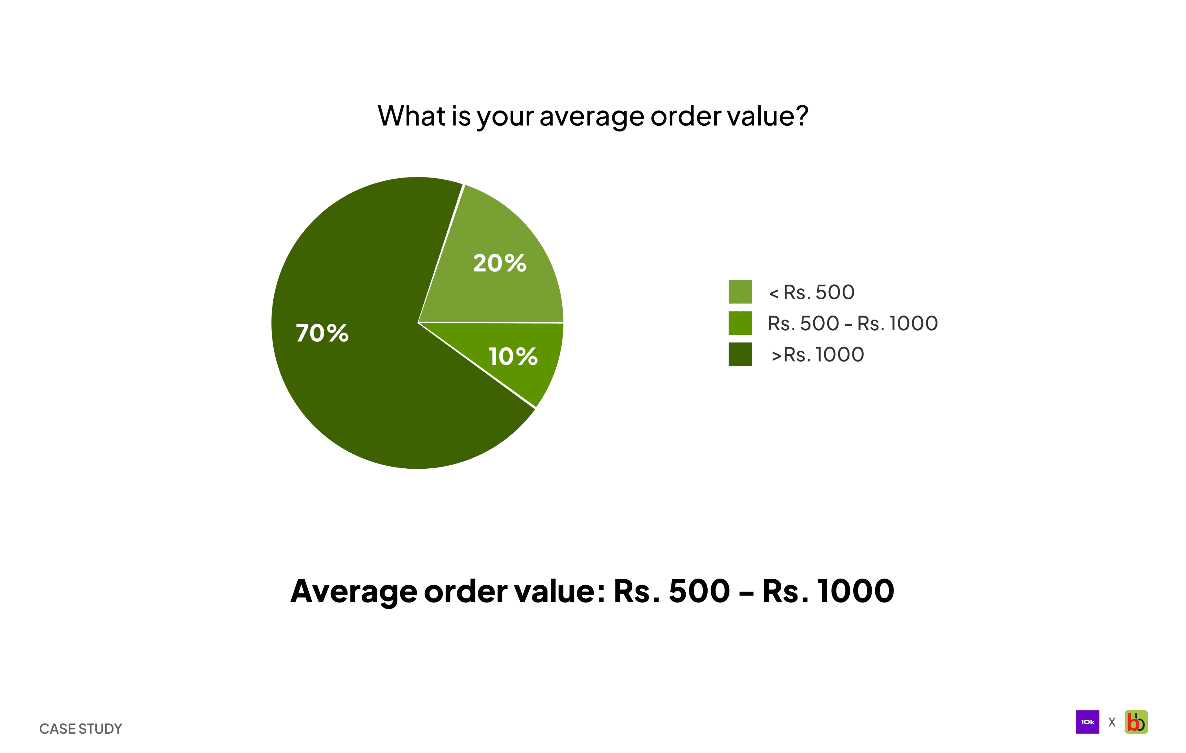
Average order value
Average order value
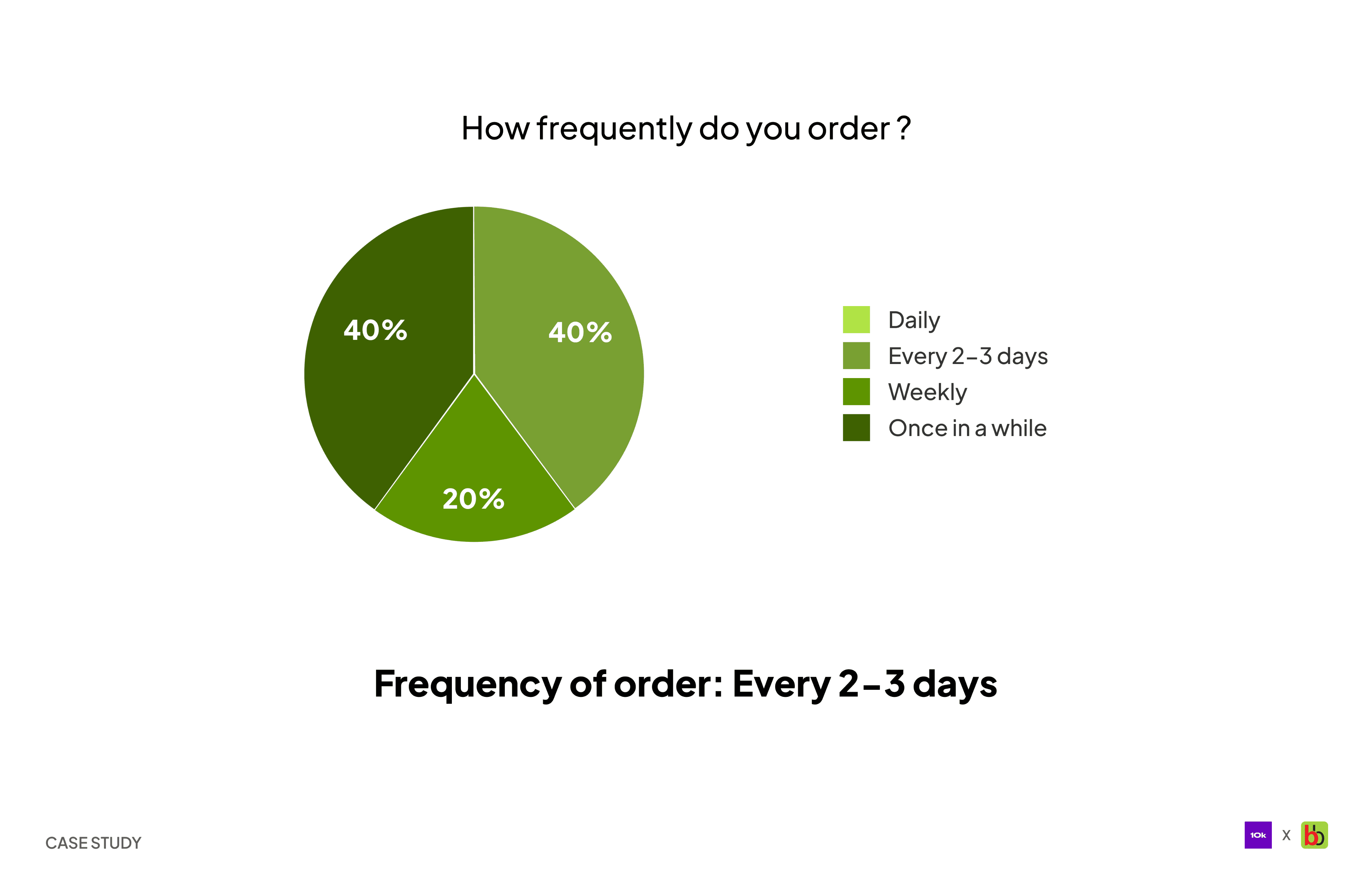
Frequency of order
Frequency of order
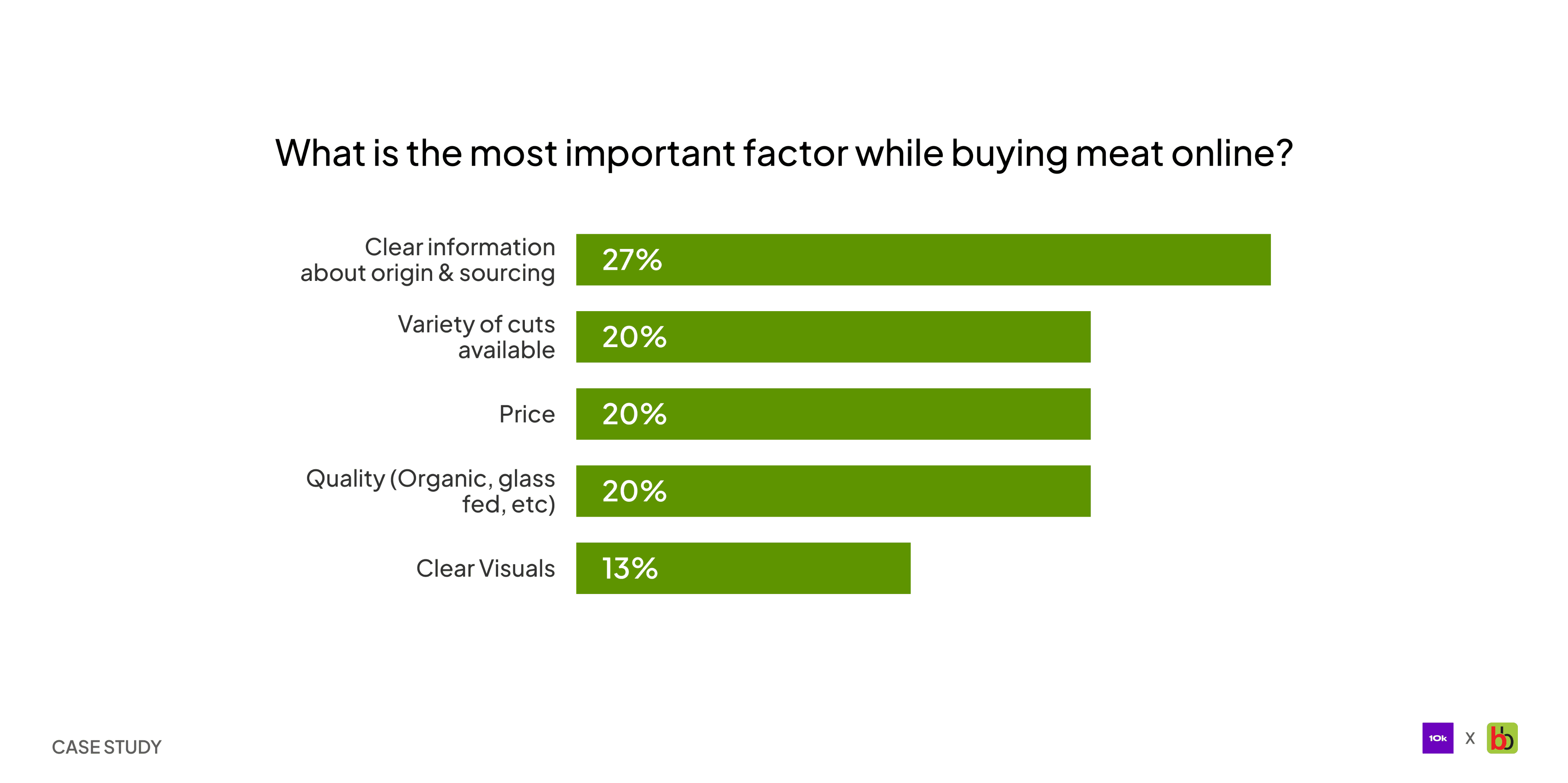
Most important factor while buying meat online
Most important factor while buying meat online
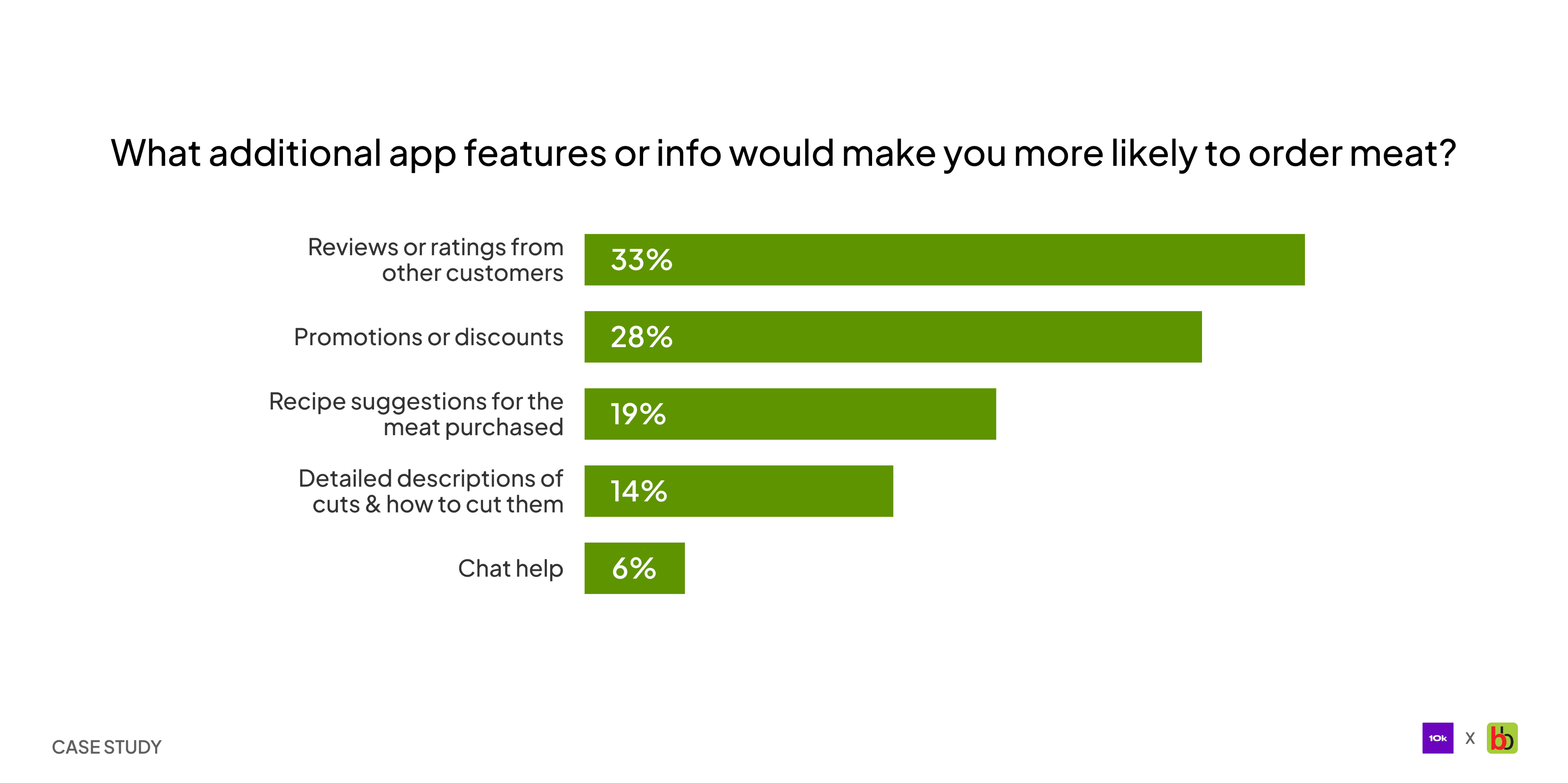
Additional features or information users wants
Additional features or information users wants

After accumulating the insights from the research, I outlined the JTBD for the redesign and got to work.
After accumulating the insights from the research, I outlined the JTBD for the redesign and got to work.
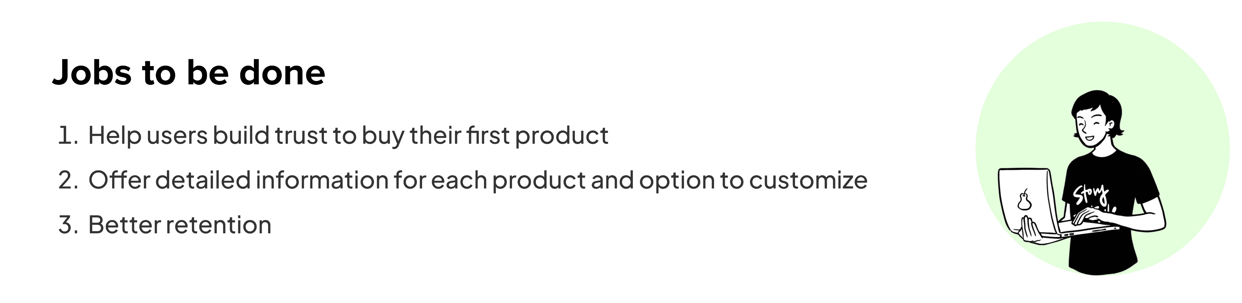
Jobs to be done [Illustration made using Storytribe]
Jobs to be done [Illustration made using Storytribe]
Let’s starts the fun part✨
Let’s starts the fun part✨
We’ll walk through each part of the app, discussing its features and the reasoning behind them, followed by a flow that includes screenshots from the app prototype.
We’ll walk through each part of the app, discussing its features and the reasoning behind them, followed by a flow that includes screenshots from the app prototype.
Home Screen
Home Screen
Home screen is the first thing a user sees upon opening the app, and this experience sets the course for the rest of the app. So, setting up users for a great experience is crucial. With this in mind, I kept the home screen simple & easy to navigate. The aim is to design a classic shopping experience found in e-commerce apps.
Users frequently experience the paradox of choice. To address this, I have created an extensive category selection that caters to both first-time and returning users.
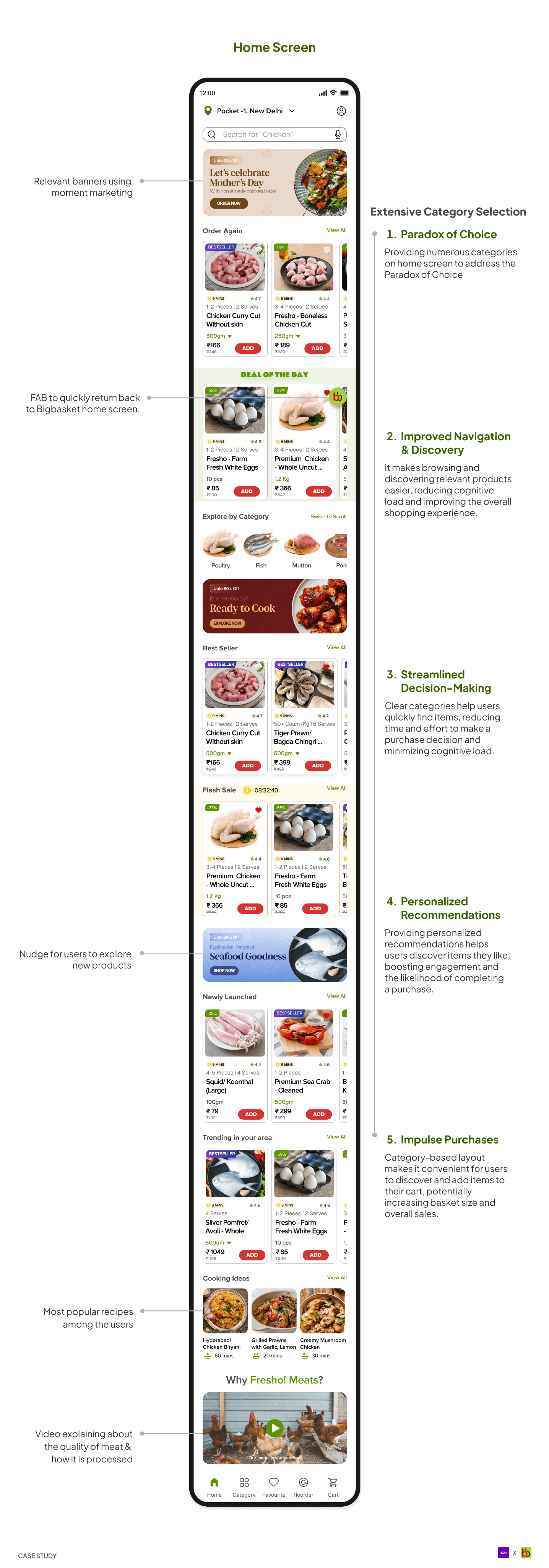
Breakdown of homescreen
Breakdown of homescreen
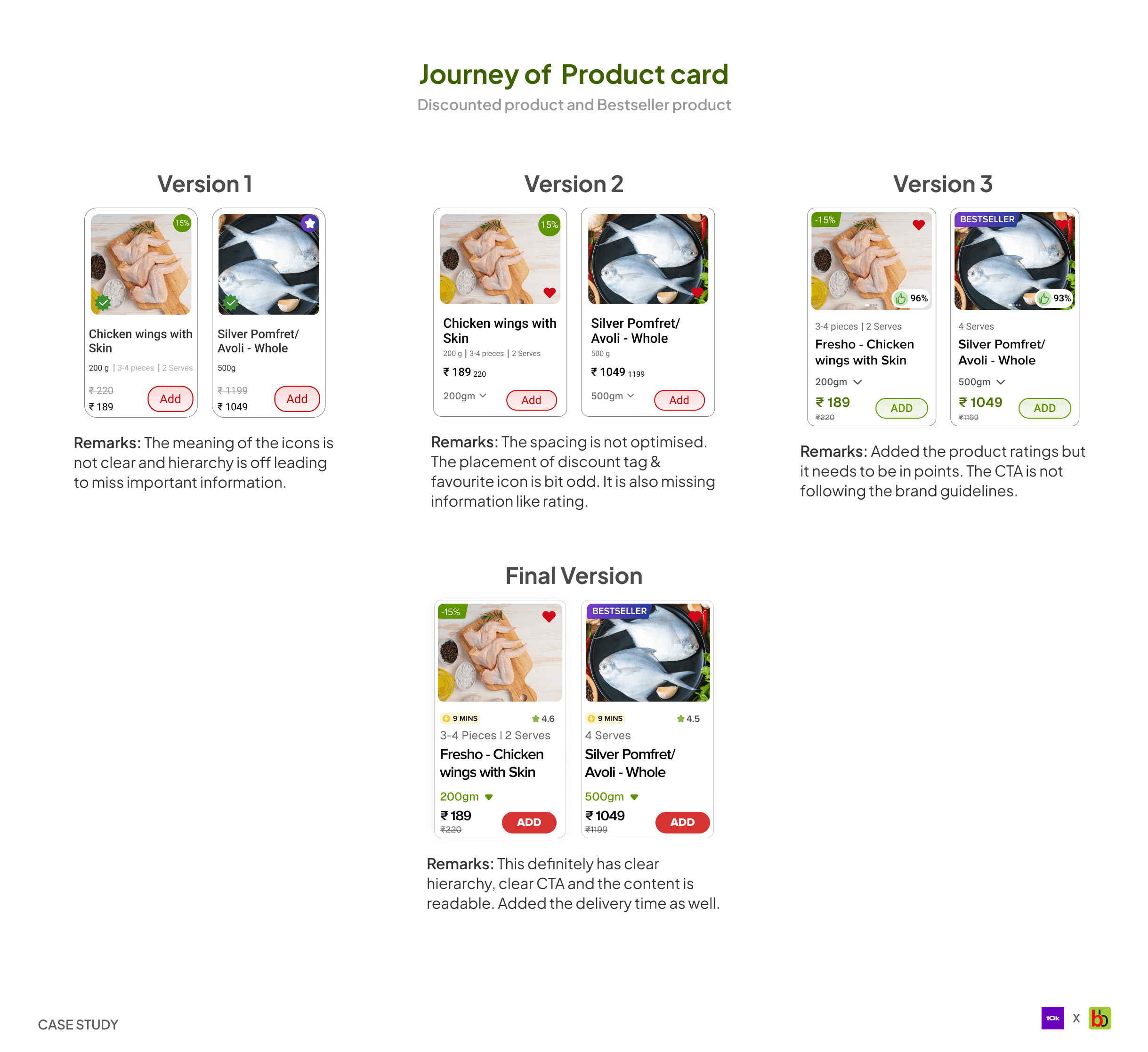
Product Cards
Product Cards
The product card is a critical component that provides all the necessary information users need to make an informed decision. When working on the cards, I had to ensure that all the information is presented in a way that allow users to access it easily while also adhering to the brand guidelines.
The product card is a critical component that provides all the necessary information users need to make an informed decision. When working on the cards, I had to ensure that all the information is presented in a way that allow users to access it easily while also adhering to the brand guidelines.
Let’s explore the flows connecting the homescreen.
Let’s explore the flows connecting the homescreen.
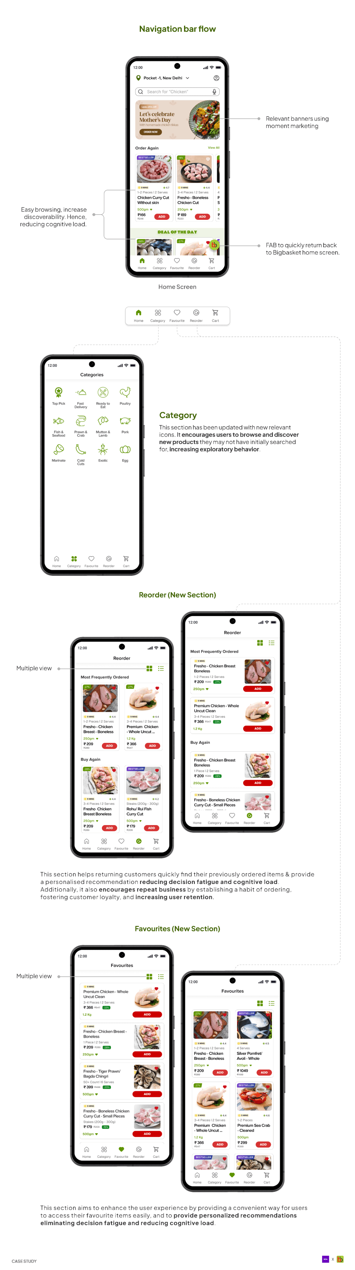
1. Navigation bar flow
1. Navigation bar flow
1. Navigation bar flow
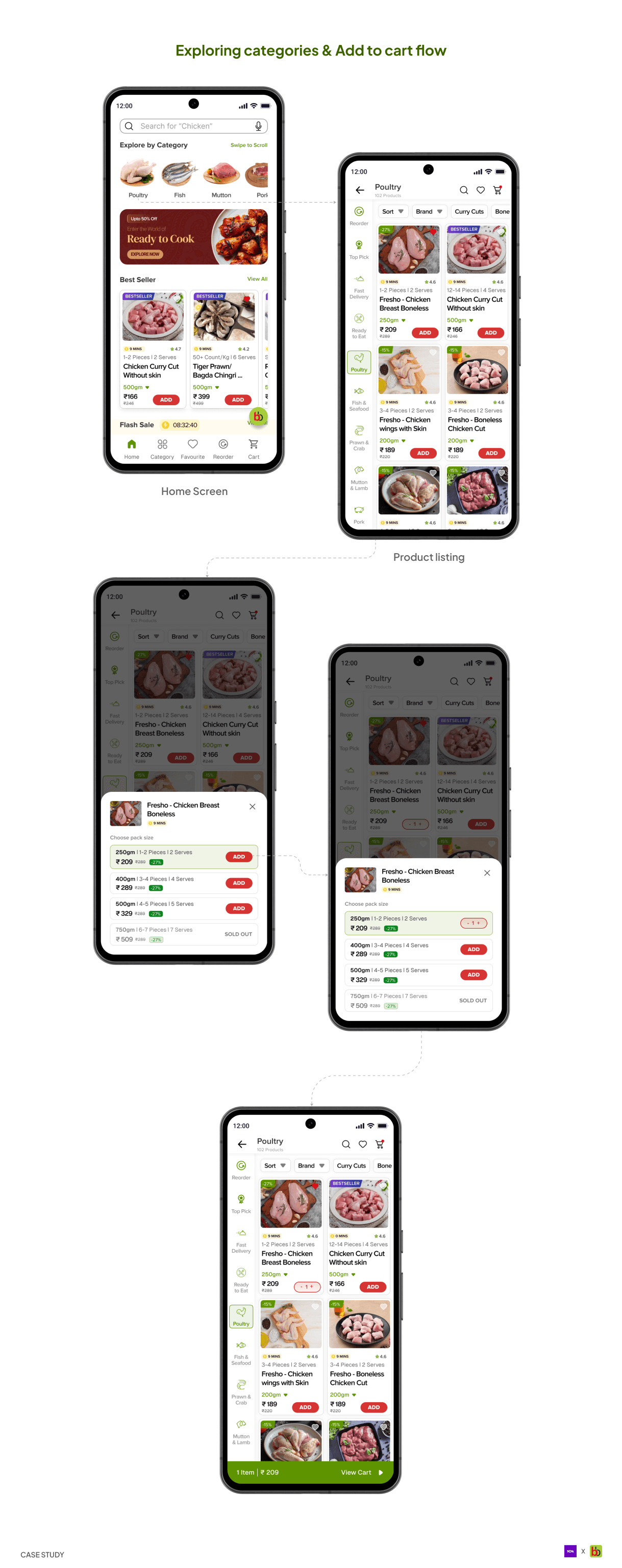
2. Exploring categories & Add to cart flow
2. Exploring categories & Add to cart flow
Product listing Screen
Product listing Screen
When a user clicks on a category from the home screen or category tab, the user can access this screen. It contains all the products available in that category and offers the option to switch to a different category and add filters.
When a user clicks on a category from the home screen or category tab, the user can access this screen. It contains all the products available in that category and offers the option to switch to a different category and add filters.
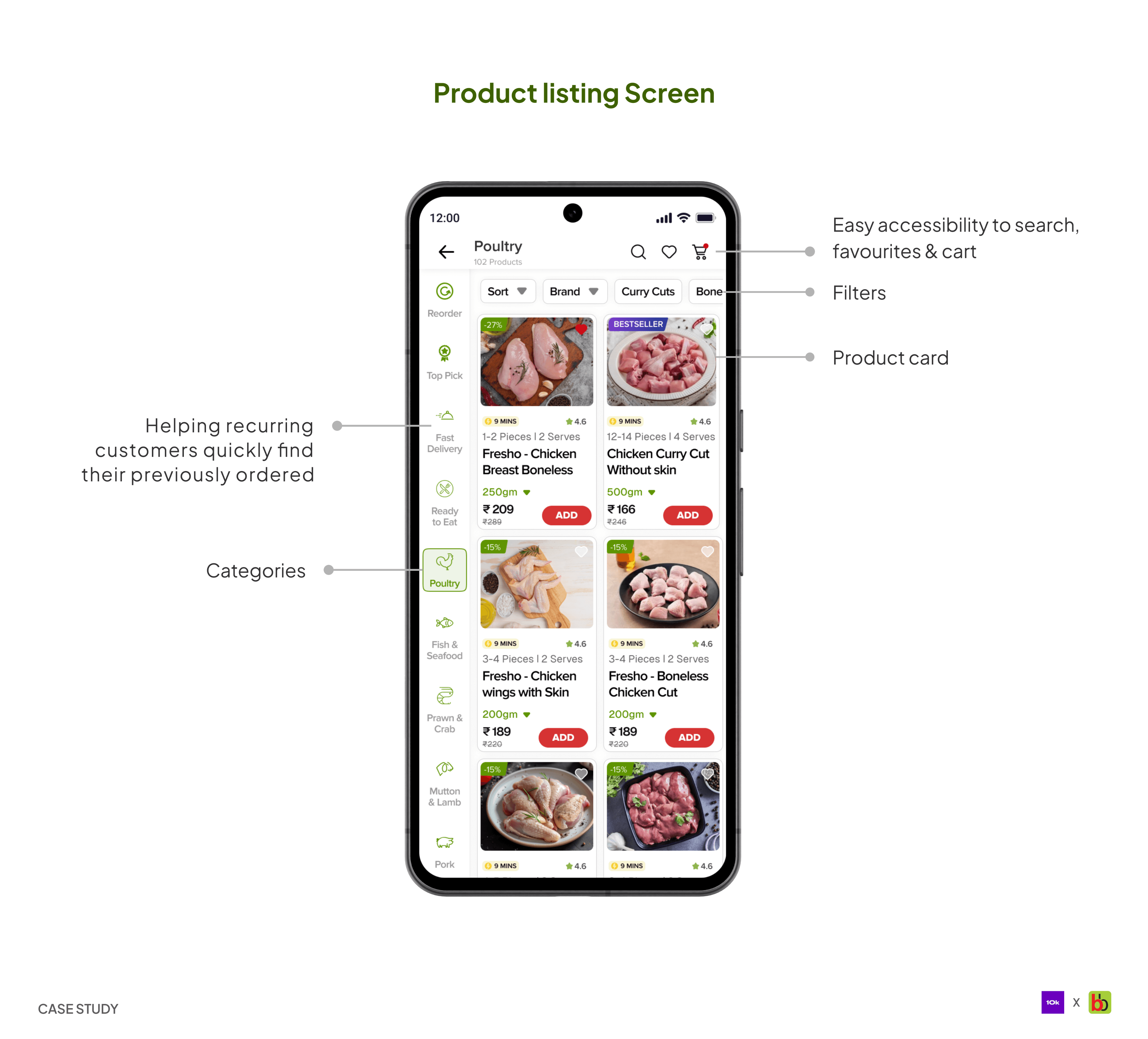
Breakdown of product listing screen
Breakdown of product listing screen
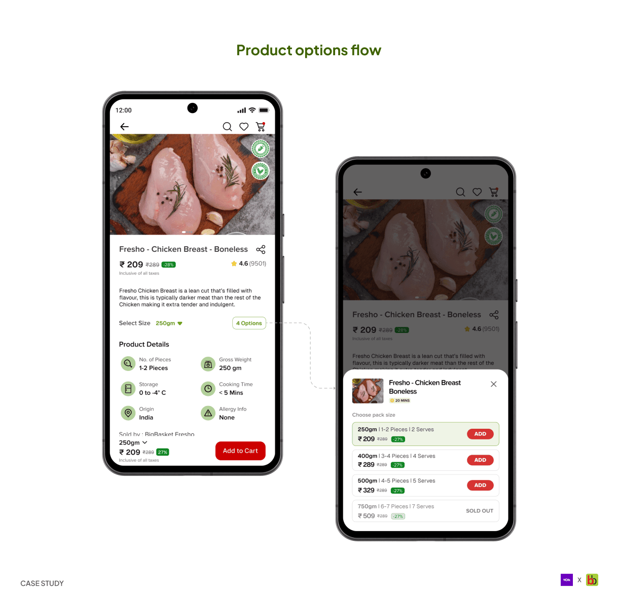
Product detail Screen
Product detail Screen
Once the user has made up their mind about the product and wants to learn more, this screen opens up. It contains all the nitty-gritty details about the product, helping the user make a much more informed decision.
Once the user has made up their mind about the product and wants to learn more, this screen opens up. It contains all the nitty-gritty details about the product, helping the user make a much more informed decision.
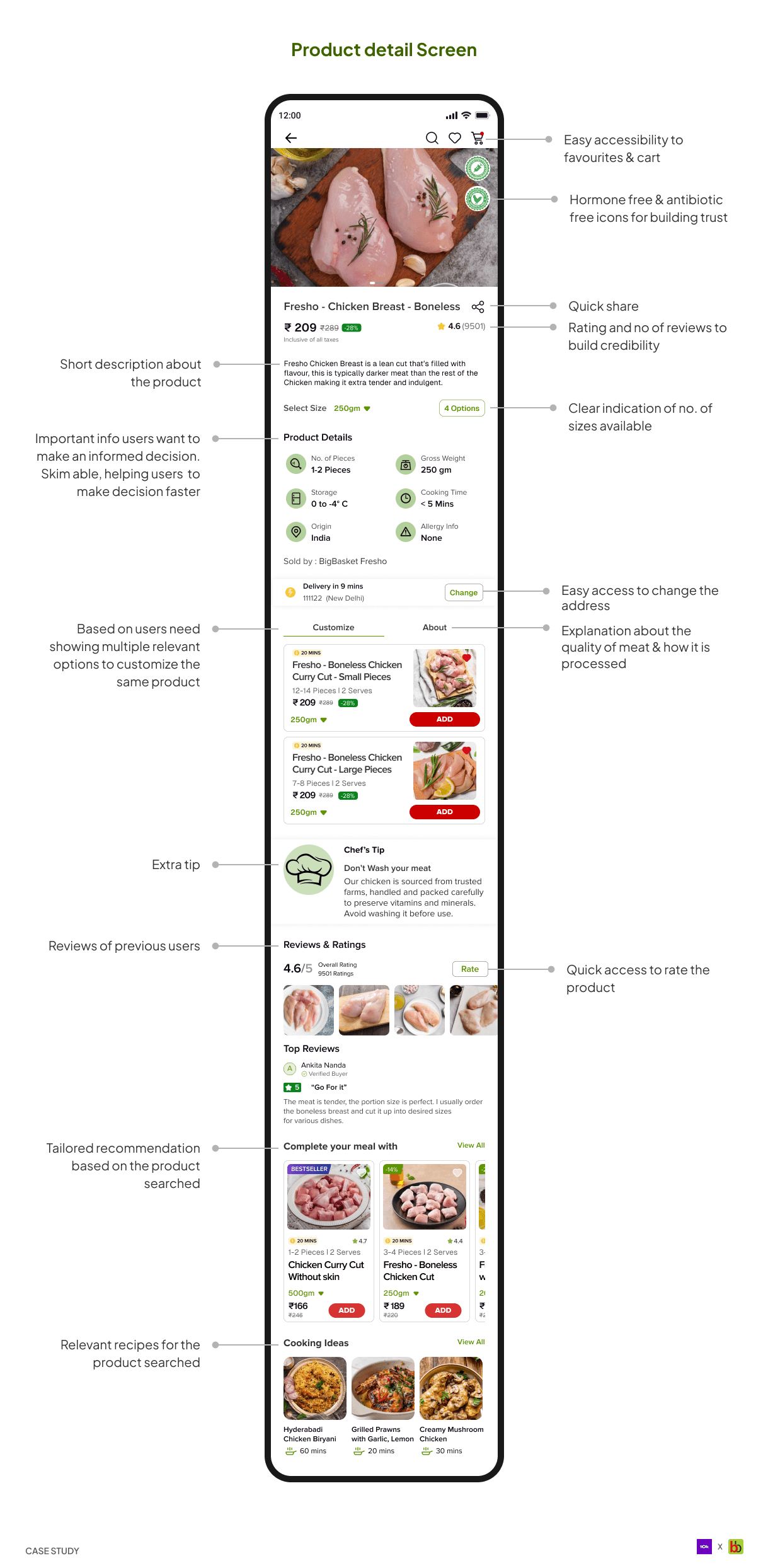
Breakdown of product detail screen
Breakdown of product detail screen
That’s all for the product detail screen. Let’s move to the last flow of this project.
That’s all for the product detail screen. Let’s move to the last flow of this project.
That’s a wrap!
That’s a wrap!
I thoroughly enjoyed working on this project. It was both challenging and enjoyable. A huge shoutout to fantastic folks at 10kdesigners or invaluable feedback and constant support.
Thank you so much for reading! Hope you enjoy reading the case study. I had great time working on it.
I thoroughly enjoyed working on this project. It was both challenging and enjoyable. A huge shoutout to fantastic folks at 10kdesigners or invaluable feedback and constant support.
Thank you so much for reading! Hope you enjoy reading the case study. I had great time working on it.